Services
We provide you with the tools you need to create a full learning experience on the web. We will teach your children with unique techniques.


The term PHP is an acronym for PHP: Hypertext Preprocessor. PHP is a server-side scripting language designed specifically for web development. It is open-source which means it is free to download and use.


LEARNING REACT
The term PHP is an acronym for PHP: Hypertext Preprocessor. PHP is a server-side scripting language designed specifically for web development. It is open-source which means it is free to download and use.
overlapping section
When we resize the screen it will always be in the middle of the image which has been set as a background


The term PHP is an acronym for PHP: Hypertext Preprocessor. PHP is a server-side scripting language designed specifically for web development. It is open-source which means it is free to download and use.


design with call to action


Exmple 1 of call to action


Exmple 1 of call to action


Exmple 4 of call to action
Template Widget
We use to create any design. To use this, we will choose a template widget and then drag and drop. You can search the template and use it if you have already saved it. To save it click on six dots (edit section) and right click and then save it as a template and give it any name


Exmple 4 of call to action
design with Lottie


Example 1 of Lottie
We use Lottie to create animated designs. We can simply choose any design and paste it here.
We can get any animated design from lottiefiles.com. We can search for any animation from the search bar such as the web and then we can also change the color by clicking on edit animation logging into this and then downloading it with JASON Lottie and then uploading it.


Example 2 of Lottie
We use Lottie to create animated designs. We can simply choose any design and paste it here.
The animation can be handled by the image we have selected. We need to click on the pencil icon on the animated image and then go to content>> settings >> trigger[it will tell when you want to animate the image and other options] .


Example 1 of Lottie
We can learn how to use it by watching the YouTube video by clicking on the YouTube link.
design with call flip box


Example of Flip Box
We use Flip Box to show the different content and style when you hover.
We can create any card that will have images and content and when we hover on that, we can show different images and content. With the help of this, we can show the front and back sides of any card with different images and content. When we use it, we get front, back, and settings. The front is used to target the front and the back is used to target the back part. Under settings, we have the option to change the height, border radius, flip direction to change the direction of flip and flip effect such as flip, side, push, etc.


Example of flip box content title


Example of Flip Box
We use Flip Box to show the different content and style when you hover.
We can create any card that will have images and content and when we hover on that, we can show different images and content. With the help of this, we can show the front and back sides of any card with different images and content. When we use it, we get front, back, and settings. The front is used to target the front and the back is used to target the back part. Under settings, we have the option to change the height, border radius, flip direction to change the direction of flip and flip effect such as flip, side, push, etc.
Example of flip box content title


Example of Flip Box
We use Flip Box to show the different content and style when you hover.
The front is used to target the front and the back is used to target the back part. Under settings, we have the option to change the height, border radius, and flip direction to change the direction of flip and flip effects such as flip, side, push, etc. Here we have used 3d depth and this is why we can see a 3d effect when you hover. We have used arrow sign from website by coping HTML of arrow sign


Sale upto 50%
Click on the button to buy
BUY NOW ➞design with price table


Example of Price Table
We use it to create a Price Table as shown below:-
BASIC
1 ACCOUNT-
1 Account
-
100 GB SPACE
-
1 DOMAIN


Example of Price Table
We use it to create a Price Table as shown below:-
ADVANCE
5 ACCOUNT-
200 GB SPACE
-
200 GB SPACE
-
200 GB SPACE


Example of Price Table
We use it to create a Price Table as shown below:-
PRO
100 ACCOUNT-
List Item #1
-
List Item #2
-
List Item #3
design with table of contents


Example of Flip Box
We use Table of Contents to Display Content as shown below:-
You can read and learn how to use it by clicking on it.
Table of Contents/The Contents Of The Page
design with PRICE LIST


Example of Price List 1
We use Price List to show the data the way shown below:-
You can read and learn how to use it by clicking on it.


Example of Price List 2
We use Price List to show the data the way shown below:-
You can read and learn how to use it by clicking on it.
design with hotspot


Example of Hotspot
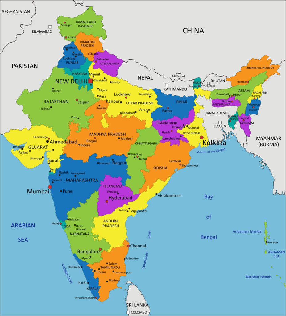
We use Hotspot to show the address or any information as a tooltip when you click on it.
We can use it by dragging and dropping the Hotspot widget to any section. When we click on the pencil icon, we have an image to choose and align. We can also add icons if we want. We can set the position of our address using the position tab under the content section. We can set text or icons to show our location. Here, Tooltip means the address or message you will see when you click on Hotspot(or text )
Contact
For any inquiries please email

Kirti Nagar, Gurgaon, Haryana- 12202
Kestopur, Kolkata
